Possible Layout and Themes (Coffee Store)
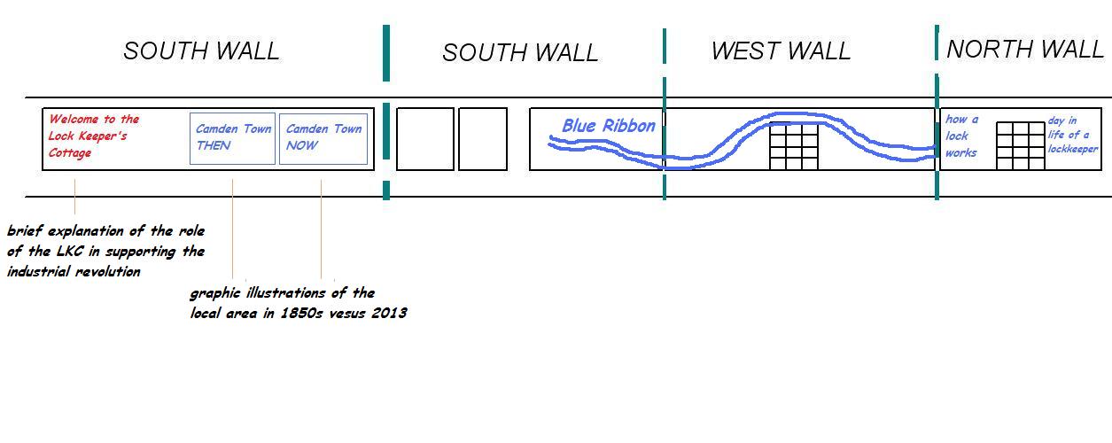
Ideas for discussion.There will be some striking illustrations on the main walls to remind visitors and customers that they have just entered an important historical building. There needs to be a prominent message saying "Welcome to the Lock Keeper's Cottage in Camden Town". This could be on the back wall (the most visible wall in the store) or maybe on the wall opposite the servery - or in both places?. This could be followed by a short summary, explaining that the building was completed in 1816, and that it is positioned at the first of eight locks on the Regent's Canal's descent to sea level at Limehouse. Given that the famous locks are visible from the coffee house, it makes sense to run a lock keeper's theme across some of the walls, along with some illustrations of how a lock works. Last year the designers proposed a large blue ribbon stretching across the coffee store. This is still an attractive idea, because it will be very eye-catching and will give the canal great prominence on the walls. It needs careful thought, because it will be constrained by the window frames and the shape of the canal, so we need to look at different alternatives to achieve this. We need to get this right before worrying about the positioning of other illustrations on the main walls. A timeline would be very useful, spanning the period 1811 to 2020. If there is no obvious place for it in the coffee store then it could go in the dedicated Canal Information Area. |
Note - the diagram below is merely a suggestion (from Friends of the Regent's Canal) to illustrate a possible use of the wall space.
The final design could look very different from this.
|
Camden then and nowHere are some maps that show how Camden Town has changed between 1827 and 2013:- Camden-then-and-now |